Sunday, 2 January 2011
Design For Screen3.
I love the graphics on little big planet; the digital puppetry makes it unique as a video game. I find the graphics in this truly engrossing.
Making Future Magic: iPad light painting from Dentsu London on Vimeo.
'This film explores playful uses for the increasingly ubiquitous ‘glowing rectangles’ that inhabit the world.'
I saw this and thought it was amazing, it is almost magical!! However, it is the fact that it has been made into a video that makes this process work. It's amazing what you can do with an iPad and camera! I then came across these, also produced by Denstu London.....
Canon Pixma Sound Sculptures from Dentsu London on Vimeo.
Canon Pixma: Bringing colour to life from Dentsu London on Vimeo.
WOW ...just wow!!!!! The colours captured by this are awe inspiring, what a great piece of film.
Wallpaper magazine from Dentsu London on Vimeo.
....the future of magazines!
I really like the mix of the real and hand rendered, it creates a sense that their is an element of truth to the stories being conveyed.
Well, this gave me a chuckle! ...a bit of innovative thinking here.

Tuesday, 28 December 2010
Design For Screen2.
our creative process/. 01 from Casey Warren | MIND CASTLE on Vimeo.
....a little insight into the design process involved!
Zinio Digital Magazines & Books
Meander from Marcus Eckert on Vimeo.
This video of discovery is an advertisement Zinio. I especially like the way in which they have created type through space; this seems to engage with the audience more as they become increasingly intrigued as to what it says.
MTV/ 2 from MRfrukta! on Vimeo.
I am very fond of this as it is not apparent as to what it is from the beginning, thus keeping the viewer watching with intrigue for the reveal at the end. Another one of MTV's little gems!
MythBusters....
Using the above video, this kinetic type animation was made....
Mythbusters Kinetic Type from Bryan Woods on Vimeo.
The video won 1st place in the 2010 Academy Art University Spring Show Award Ceremony for best in motion graphics. (5/21/10)
The ability for someone to do this is beyond me. Nevertheless, animation is something i am buzzing to try out for myself.
Design For Screen.
New Future Graphic
BBC Proms
BBC Motion Tests from New Future Graphic on Vimeo.
I really like the use of the red, green and blue broken down in order to make the black when they come back together.
Electric Proms Ident from New Future Graphic on Vimeo.
I am inspired by the 3D effect this has posed.
Freeview ad with 18Feet from New Future Graphic on Vimeo.
I saw this TV Ad and liked it! In researching this kinetic type phenomenon I found it is wide spread.
Love Film Icons
LoveFilm icons from New Future Graphic on Vimeo.
Love Film Icons - 2 from New Future Graphic on Vimeo.
These two videos are very simplistic yet very effective in informing their audience about Love Film.
Collection100 ....confectionary research2.
I have researched the infamous 'Candy King' pick 'n' mix brand and found their website extremely helpful in the accumulation of my research. One thing I have noticed about their website is the high use of colour; this seems to be a running theme with sweets, promotional material and their packaging.
Candy King

They categorise their sweets to help you easily find what you are looking for.


This is a simple yet fun website offering a variety of interactive opportunities.
In contrast, I thought i'd look at the Natural Confectionary Company as they pride themselves on producing sweets using natural ingredients so it will interesting to see how the website differs.
The Natural Confectionary Company


I am very fond of this website ...there is a lot to do, but it is also educational at the same time; I think this is due to their pride over the ingredients used within their products. I especially like the aesthetics used; the hand drawn mixed with the computerised works wonders!
Rowntrees


Just take a look how the TV Ads have changed over the years.....
Retro Tuck Shop


I really like the colouring and typefaces used in this design layout.
Cadbury


The Cadbury website proved very interesting with a balance of entertainment and factual statistics.
Jelly Belly


I was extremely fond of this website; I especially like the section demonstrating how you can mix the flavours up to create a new flavour. A little bit of promotion right there.
Love Hearts


This website was very bright a girly. It also didn't seem to interact with the audience as well as some of the others.
Other Sweet Treats....


These all seem to use colour as a primary factor in drawing in an audience; the aesthetics are of real key importance.

Monday, 20 December 2010
Collection100 ....confectionary research.


Innovative Packaging Design

'Want to curb a chocolate craving without eating a ton of chocolate?
Break off a piece of the Girth Control Dark Chocolate Bar. The flavour of dark chocolate is so intense, you'll only need a few bites to tide your craving (at least until dessert!)'

'All's fair in love and marriage...except when it comes to chocolate, that is!
This his-and-hers rich milk chocolate bar is perfectly portioned to ensure martial bliss. A great gift idea for weddings and anniversaries!'


'Because you never know when an intense chocolate craving can strike, always be prepared with stash of Emergency Milk Chocolate.'


These extremely witty and clever designs are produced by Bloomsberry&Co. I am truly fond on these designs ...I think they add a little something more to the novelty of eating your chocolate bar.
And as for the website, it's a click of fun too!

The 'it' Bar

'The “it Bar from Dylan’s Candy Bar comes beautifully packaged in a white textured box with blind embossing, foil stamp and tip-on label.'
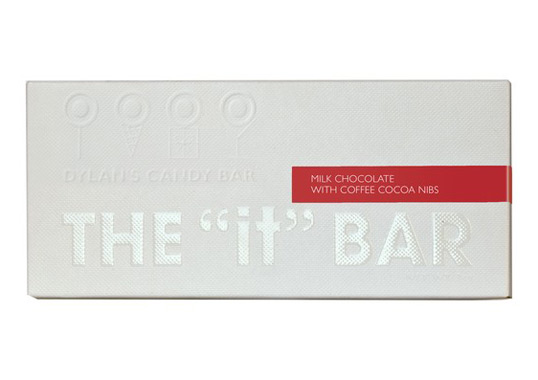
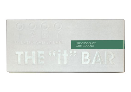
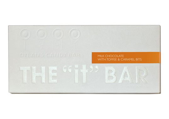
These packaging designs are simple, yet create a sense of intrigue as to whats inside.
Imaginitol

Designed by The Creative Method | Country: Australia
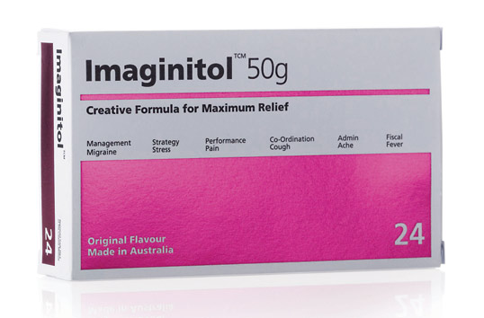
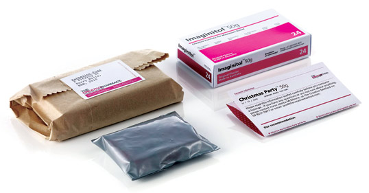
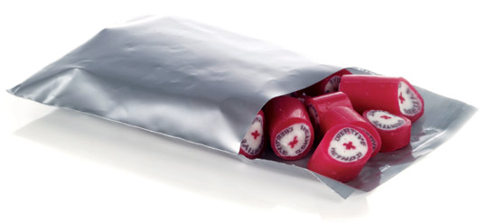
The concept of this interests me immensely; the use of the universal pharmaceutical tablet packaging creates a sense of intrigue, resulting in a humorous and memorable piece of design. This design was used as an invitation to a christmas party and later as a new business teaser. Stunning.
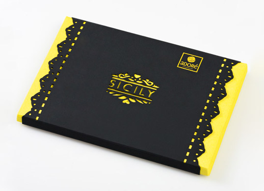
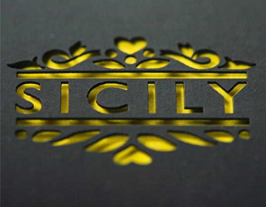
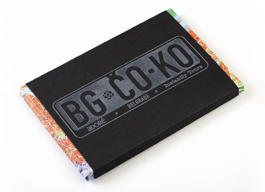
Adore Fine Chocolate

Designed by Coba & Associates | Country: Serbia
']Using thermal block foil, laser-cut paper and special printing techniques have resulted in designs that communicate that Adoré Chocolate provides more than just taste – it is a brand that takes you on a journey.”
These handmade chocolates are packaged in a way that each flavour has its own design and look; thus generating a chocolate bar you cannot resist to pick up.


Fling

Designed by Anchalee Chambundabongse | Country: United States
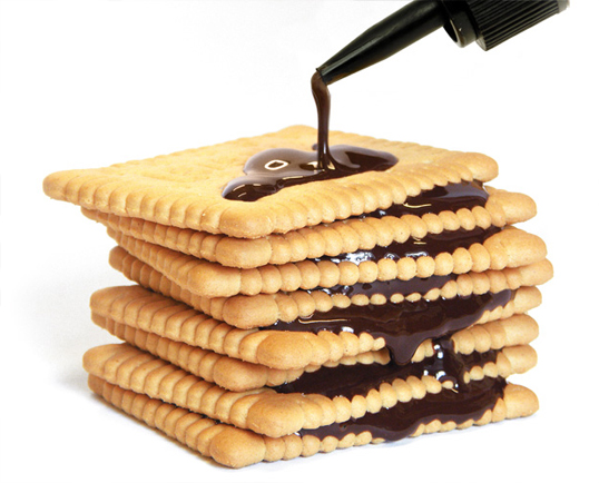
The Deli Garage Schokoleim
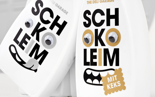
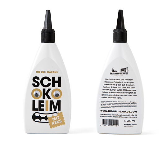
Designed by KOREFE | Country: Germany
This chocolate sauce has been packaged in a classic wood glue bottle, demonstrating the quirky use of classic design to package confectionary. There is also the notion of the unexpected within this design decision.
Subscribe to:
Posts (Atom)